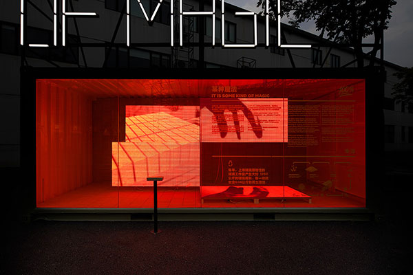
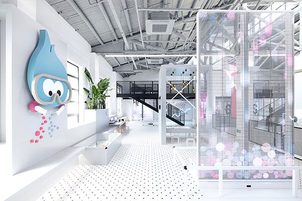
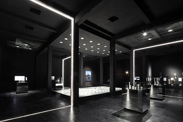
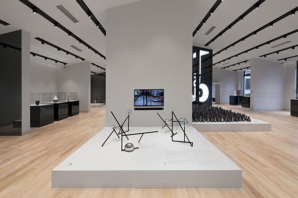
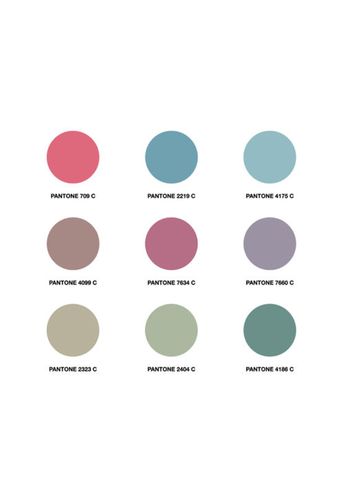
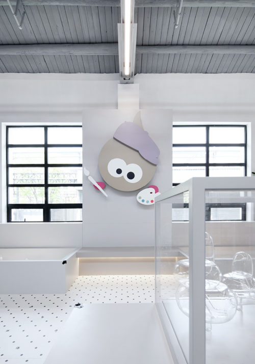
A brand-new set of visual identity is developed for the Kids Museum of Glass 2.0 (see project here), which is not only kids-driven but also artistic and can be appreciated by adults. A bold, sleek yet playful aesthetic is consistent throughout the museum, from environmental graphic and signage, to graphic panels and booklets. As an easily recognisable icon of the museum, a pair of flame-shaped mascots ‘Bobo’ and ‘Lili’ in different colours and characters are the key in the branding of the museum, playing a crucial role of connecting the space and contents. The visual presentation throughout the museum is a strong statement that this is an environment for contemporary art and design lovers, regardless of their ages.
Type:
Visual Identity
Location:
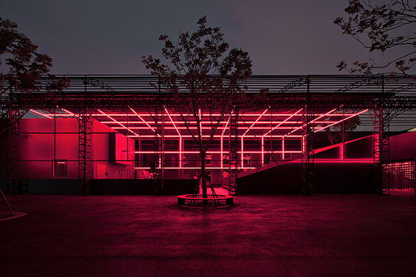
Shanghai Museum of Glass Park
685 West Changjiang Road, Baoshan District, Shanghai, China
Assignment:
Concept Design
Detail Design
Production Supervision
Year of Completion:
2021
Team:
Tilman Thürmer
Francesca Inchingolo
María Fernanda González Prendes
Yichun Chen
Bon Wen
Client:
Shanghai G+ Culture Creative Developing Co.,Ltd
Photos:
COO
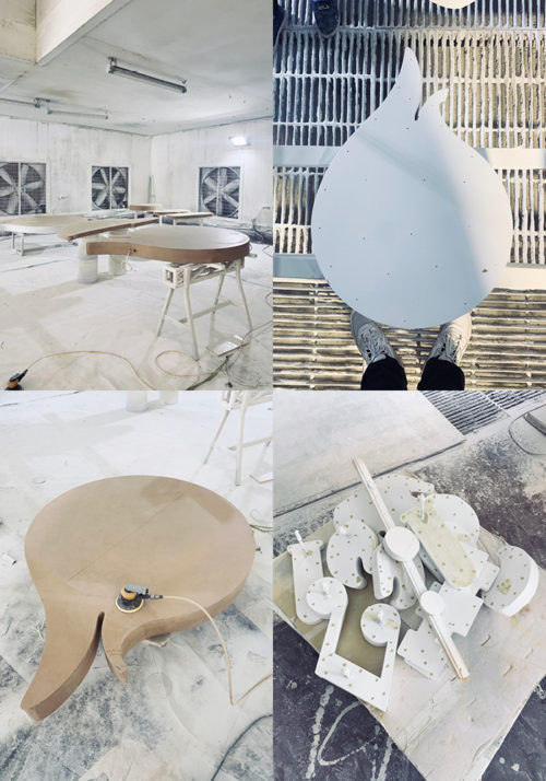
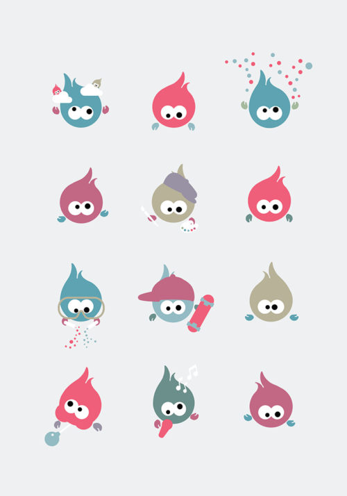
Museum Mascot ‘BoboLili’
Bobo and Lili are a pair of flame-shaped museum mascots with googly eyes that greet visitors and guide them through the museum. Named after the two characters of glass in Chinese ‘Bo Li’, these adorable mascots take the form of the important element of the glass-making process – flame in the kiln. Based on one simple shape, the museum mascots Bobo and Lili come in several colours and characters that are related to the contents, adding attractive visual narratives to the exhibition. Their easily recognisable shape combining with variations of colours and accessaries create a playful visual language that can be connected with kids-driven contents in the exhibition.
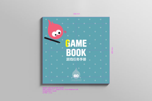
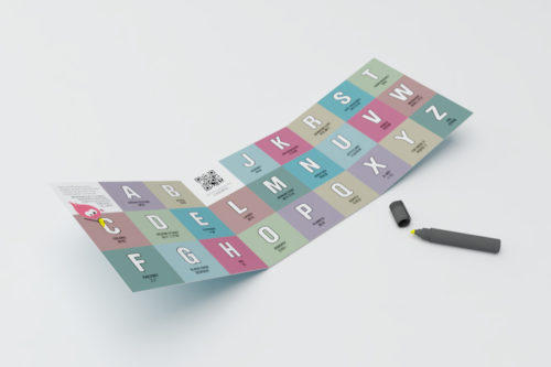
Gamebook
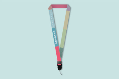
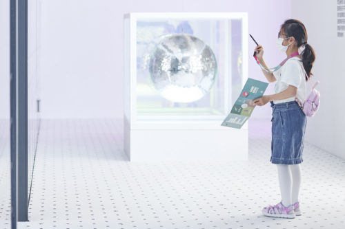
The 26 exhibits in the museum are connected through a scavenge game which encourages young visitors to explore the space independently, collecting clues spread across the museum. At the door, young visitors are given a package, consisting of a specially designed gamebook, a pen and a colourful lanyard. The gamebook plays a central part in the visiting experience, threading all the 26 exhibits and contents together. In the gamebook, each exhibit is represented by a letter from the English alphabet and kids are invited to look for them in the museum. Once found the matching exhibit, visitors can fill the blank letter with the pen. Along with other playful exercises in the book, it is an effective facilitator for children to take initiative in learning and free the parents from constant guidance.
ABC-Captions
Breaking away from a typical exhibition with structured content and fixed visiting routes, the Kids Museum of Glass 2.0 presents the diversity of this versatile material through bite-sized contents spread across the space. Without a specific order, each exhibit is represented by one letter of the English alphabet on the caption which helps young visitors to identify and document in their gamebook. Each caption reveals stories or facts about glass in a succinct and informative description. The texts are playful and concise, aiming to pique visitors’ interest. In the museum, knowledge about glass is communicated through layers of contents in different forms and depth. Instead of explaining in depth, each ABC caption works as the surface layer, leading visitors to find out more about the topics that interest them. More explanatory contents are presented on graphic panels and short videos. Layered information allows different levels of engagement and interests.
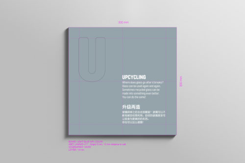
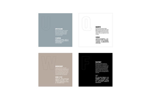
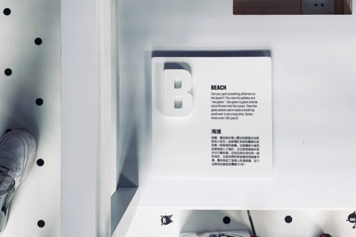
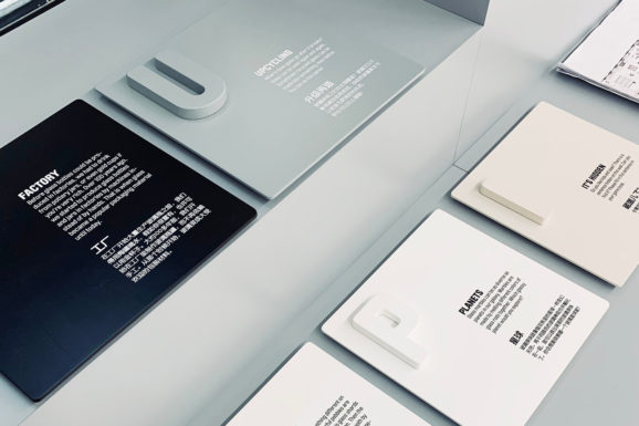
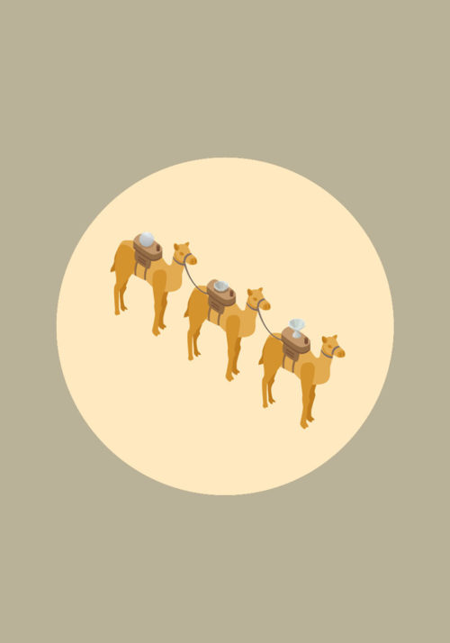
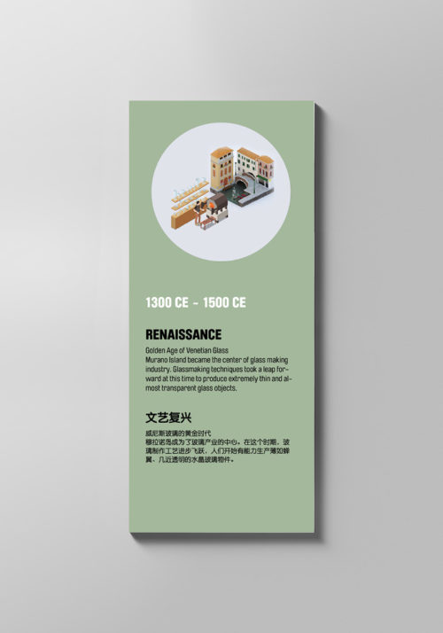
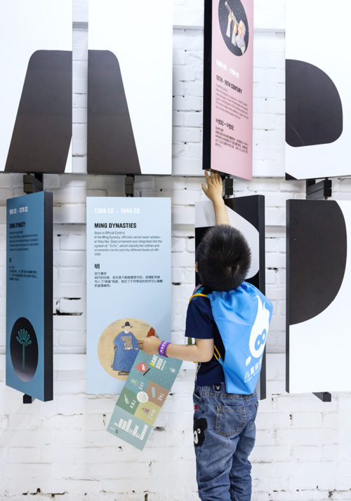
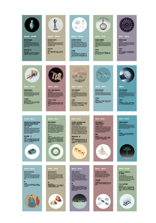
Exhibit ‘Timeline’
An exhibit ‘Timeline’ is dedicated to show the key developments of glass and the role it plays in human history, art and culture in China and the west. The exhibit is composed of 20 flippable panels in two rows, unfolding stories of glass in the east and west respectively. On one side of the panel, a graphic representation of an object or a photograph unveils a key moment in the history of glass. On the other side, an impactful graphic is revealed once all the panels are turned to the same side. This exhibit aims to present the timeline with a different approach from a more commonly-seen chronicle of events. With kids-friendly description and visual contents, this hands-on exhibit invites visitors of all age to literally ‘flip through’ the history of glass.
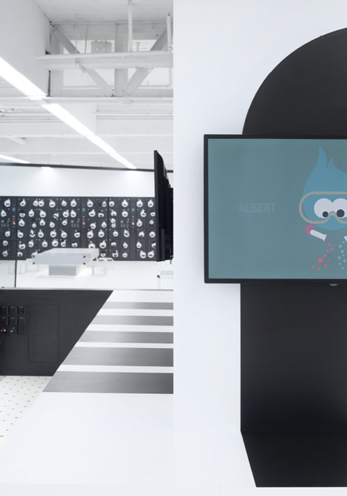
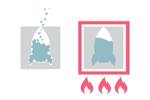
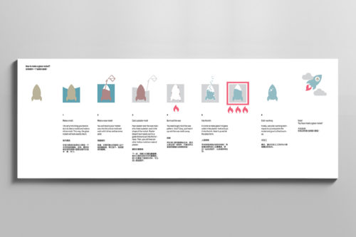
Rocket-Making
One of the challenges on the graphic design of the museum is transforming complex information into easily understandable texts and visual elements for children. The exhibit ‘Workshop’ displays how a glass rocket is made with lost wax technique. The process is broken down into steps and explained through clean graphic representation. Along with the physical display of the glass rocket from each step and a video, visitors are able to understand the technique easily.
‘Did You Know?’
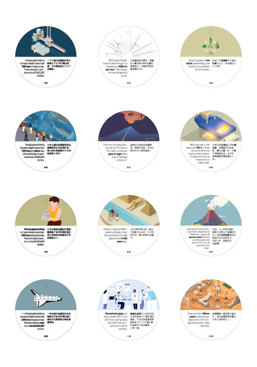
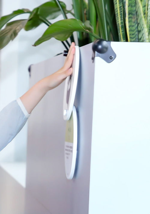
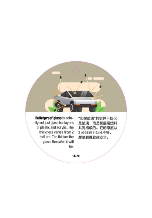
Twenty small discs bearing interesting facts about glass add educational ‘surprises’ to the explorative journey through the interactive exhibits in the museum. Consisting of two discs, the cover attracts attention with a museum mascot with magnifying glasses and an intriguing title ‘Did you know?’. As visitors slide the cover up, the disc underneath then reveals a short paragraph about an unexpected fact about glass with visually attractive graphics that illustrate the stories. These hands-on displays seem to scatter around the space randomly, yet each has a connection with the exhibits nearby. The design evokes the joy of discovery as visitors find them in unexpected places in the museum.

Related Projects